
REDESIGN
VOLTZ ACCOUNT
A redesign proposal to improve the user experience.
THE PROBLEM
The current application has accessibility problems, in addition to a lack of hierarchy in information about its functionalities.
-
Insufficient color contrast. Some screens are difficult to read, especially on devices with small screens or in low-light environments.
-
Lack of hierarchy in features. The information and features are not well organized, which makes the application difficult to navigate.
-
Lack of defined grid. The layout of the screens is inconsistent, which makes the application difficult to remember.
-
Difficulty adapting a product showcase. The app is not flexible enough to accommodate different types of products.
-
Limited accessibility. The application has some accessibility problems, which may make it difficult for people with disabilities to use.
SEARCH WITH
USERS
We carried out a usability test with users, using the Maze platform and had important discoveries.
We carried out a usability test of the current version of the application, using the Pix journey. The test helped us understand how users interact with the app, what they find important and how long it takes to make a Pix transfer.
HIGHT POINT
TEAM
GOAL
Identify flaws in the journey and interface
Filipe Silva (me) - PD
How do users interact with the app to make a Pix transfer?
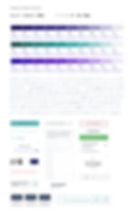
Qual sua primeira impressão do
aplicativo, acha ele funcional?
65% SIM
Você teve alguma dificuldade em fazer a transferência Pix?
73% Não
Taxa de cliques errados:
53%
Tempo médio para execução da transferência Pix?
25 seg
Como foi sua experiência em fazer a transferência Pix?
8,4 muito boa
BENCHMARK
Analysis of other digital accounts
It is an important step in the product development process. It allows you to understand the market in which you operate, identifying best practices and identifying opportunities for improvement.


USER FLOW
Based on the analysis of the tests, I created an easy and direct journey for users, solving the main usability problems.
This is an example of the simplest Pix transfer flow, providing the best user experience.

GRID, WIREFRAME
AND PROTOTYPE OF
HIGH FIDELITY
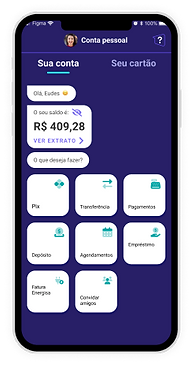
Based on usability testing analyses, we propose the following solution:


I created other screens showing other possibilities for transferring via Pix

STYLEGUIDE AND
COMPONENTS
CONCLUSIONS
We repeated the usability test and had the following results:
-
Resolvemos o problema de contraste de cores valorizando o fundo branco.
-
Categorias de funcionalidades e produtos no app, deixando a interface mais organizada e com uma hierarquia melhor da informação.
-
Definimos um grid de 4 colunas que resolveu a estrutura dos componentes.
-
Dificuldade para adaptar uma vitrine de produtos. O aplicativo não é flexível o suficiente para acomodar diferentes tipos de produtos.
Qual sua primeira impressão do
aplicativo, acha ele funcional?
85% SIM
Você teve alguma dificuldade em fazer a transferência Pix?
87% Não
Taxa de cliques errados:
32%
Tempo médio para execução da transferência Pix?
20 seg
Como foi sua experiência em fazer a transferência Pix?